5 Interior Design Lessons from Your Favorite Movies
5 Interior Design Lessons from Your Favorite Movies
Movies have long been a source of inspiration and entertainment, but they can also be a surprising source of interior design insights. The psychology of color in interiors is a crucial element that can profoundly impact our mood, emotions, and overall well-being. By studying the way color is used in the sets and scenes of our favorite films, we can glean valuable lessons about how to harness the power of color to create spaces that are not only visually stunning but also emotionally resonant.
In this research summary, we'll explore five interior design lessons we can learn from the masterful use of color in some of cinema's most iconic movies. From the moody blues of The Grand Budapest Hotel to the vibrant hues of The Shape of Water, these films offer a wealth of inspiration for anyone looking to elevate their home decor with a deeper understanding of color psychology.
Lesson 1: Color Can Evoke Emotion
One of the most fundamental lessons we can learn from movie set design is the power of color to evoke emotion. Color psychology in interior design plays a crucial role in shaping the mood and atmosphere of a space. By carefully selecting and combining colors, filmmakers can create a visual language that resonates with the audience on a deep, emotional level.
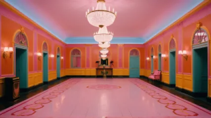
A prime example of this can be seen in the critically acclaimed film The Grand Budapest Hotel, directed by Wes Anderson. The movie's distinctive color palette, dominated by shades of blue, creates a sense of melancholy and nostalgia that perfectly complements the film's bittersweet narrative. The cool, muted tones evoke a feeling of longing and introspection, while the pops of vibrant color, such as the rich burgundy of the hotel's interiors, add depth and visual interest.
"Color is to the eye what music is to the ear." - Louis Comfort Tiffany Louis Comfort Tiffany, American artist and designer
Similarly, the use of color in The Shape of Water is a masterclass in emotional storytelling. Director Guillermo del Toro's palette of lush greens, serene blues, and warm earthtones creates a sense of wonder and transcendence, mirroring the film's themes of love, acceptance, and the beauty of the natural world. The color choices in this film evoke a sense of tranquility, wonder, and the boundless possibilities of the human experience.
Lesson 2: Color Can Influence Perception of Space
Another crucial lesson we can learn from movie set design is the way color can be used to manipulate the perception of space. By strategically applying color, filmmakers can make a space appear larger or smaller, taller or more intimate, depending on the desired effect.
In the film The Grand Budapest Hotel, for example, the use of vibrant, saturated colors in the hotel's interiors creates a sense of grandeur and opulence, making the spaces feel grander and more expansive than they may be in reality. Conversely, the use of cooler, more muted tones in the film's exterior scenes gives the impression of a smaller, more confined world, reinforcing the sense of nostalgia and a bygone era.
Similarly, the use of color in The Shape of Water plays a significant role in shaping the perception of the film's underwater setting. The predominance of cool, aquatic hues, such as blues and greens, creates a sense of depth and expansiveness, making the viewer feel immersed in the film's lush, otherworldly environment.
"Color is not just a visual experience; it has the power to affect our emotions, our perceptions, and even our physical well-being." - Angela Wright Angela Wright, color psychologist
By understanding how color can be used to manipulate the perception of space, interior designers can create environments that feel more open, airy, and inviting, or more cozy and intimate, depending on the desired atmosphere.
Lesson 3: Color Can Communicate Character and Narrative
In addition to evoking emotion and shaping the perception of space, the use of color in movie set design can also be a powerful tool for communicating character and narrative. By carefully selecting and applying color, filmmakers can reveal important information about a character's personality, mood, and arc within the story.
A prime example of this can be seen in the film The Royal Tenenbaums, directed by Wes Anderson. The Tenenbaum family's distinctive color palette, which includes rich, jewel-toned hues, reflects the family's eccentricity, their sense of privilege, and their emotional distance from one another. The use of color in this film serves as a visual shorthand, allowing the viewer to immediately understand the complexities of the Tenenbaum family dynamic.
Similarly, the use of color in The Shape of Water plays a crucial role in communicating the film's central narrative. The predominance of cool, aquatic hues in the film's underwater setting is juxtaposed with the warmer, more terrestrial tones of the above-ground world, creating a visual metaphor for the film's themes of difference, acceptance, and the power of love to transcend boundaries.
"Color is a power which directly influences the soul." - Wassily Kandinsky Wassily Kandinsky, Russian painter and art theorist
By understanding how color can be used to communicate character and narrative, interior designers can create spaces that tell a story, reflecting the personality and values of the people who inhabit them.
Lesson 4: Color Can Create a Sense of Cohesion and Continuity
Another important lesson we can learn from movie set design is the way color can be used to create a sense of cohesion and continuity throughout a space. By carefully curating a consistent color palette, filmmakers can ensure that the various elements of a set or scene work together harmoniously, creating a visually unified and immersive experience for the audience.
One example of this can be seen in the Transformers film franchise, where the use of a predominantly metallic color palette, punctuated by bold accents of red and blue, creates a sense of visual coherence throughout the films' various settings, from the sleek, high-tech interiors of the Autobots' headquarters to the gritty, industrial environments of the human world.
Similarly, the use of color in the Star Wars universe is a masterclass in creating a sense of continuity and world-building. The films' iconic color palette, which features a rich tapestry of earthy tones, vibrant primary colors, and distinctive metallic accents, helps to tie together the diverse array of planets, spaceships, and characters that populate the Star Wars galaxy.
"Color is the language of the soul." - Wasily Kandinsky Wasily Kandinsky, Russian painter and art theorist
By applying the same principles of color cohesion and continuity in their own interior design projects, designers can create spaces that feel harmonious, visually engaging, and reflective of a unified design vision.
Lesson 5: Color Can Promote Mental Health and Well-Being
Perhaps the most profound lesson we can learn from the use of color in movie set design is its potential to promote mental health and well-being. A growing body of research in the field of color psychology has highlighted the significant impact that color can have on our mood, stress levels, and overall emotional state.
In the film The Grand Budapest Hotel, the use of cool, muted tones creates a sense of tranquility and introspection, which can have a calming effect on the viewer. Conversely, the vibrant pops of color in the film's interiors, such as the rich burgundy hues, can stimulate the senses and evoke feelings of warmth and comfort.
Similarly, the use of color in The Shape of Water reflects the film's themes of harmony, acceptance, and the power of love to transcend boundaries. The predominance of serene blues and greens creates a sense of peace and well-being, while the film's occasional bursts of vibrant color, such as the striking red of the protagonist's dress, add a sense of vibrancy and joy.
"The greatest and most important problems of life are all in a certain sense insoluble ... They can only be answered by feeling." - Carl Jung Carl Jung, Swiss psychologist and psychiatrist
By understanding the psychological and emotional impact of color, interior designers can create spaces that not only look beautiful but also promote mental health and well-being. By strategically incorporating calming, restorative colors and intentionally using vibrant hues to boost mood and energy, designers can help their clients create environments that support their overall mental health and emotional well-being.
Conclusion
The world of cinema offers a wealth of insights for interior designers when it comes to the psychology of color in interiors. From evoking emotion and shaping the perception of space to communicating character and narrative, the masterful use of color in movie set design has much to teach us about the power of color to transform our lived environments.
By studying the way color is used in our favorite films, interior designers can gain a deeper understanding of the emotional and psychological impact of color, enabling them to create spaces that are not only visually stunning but also deeply resonant on an emotional level. Whether you're looking to create a cozy, intimate sanctuary or a vibrant, energizing space, the lessons learned from movie set design can provide a valuable roadmap for harnessing the power of color to enhance mental health, well-being, and overall quality of life.
So the next time you're watching a movie, pay attention to the way color is used to tell a story, shape the mood, and influence the viewer's experience. You just might find the inspiration you need to transform your own living or working spaces into something truly extraordinary.


